Very short tutorial on how to what are and hwo to run Linear mixed effects models.
Welcome to this introduction to Linear Mixed-effects Models (LMM)!! In this tutorial we will use R to run some simple LMM and we will try to understand together how to leverage these model for our analysis.
LMMs are amazing tools that have saved our asses countless times during our PhDs and Postdocs. They'll probably continue to be our trusty companions forever.
Note
Please bear in mind that this tutorial is designed to be a gentle introduction to running linear mixed-effects models. It will not delve into the mathematics and statistics behind LMM. For those interested in these aspects, numerous online resources are available for further exploration.
This tutorial introduces the statistical concept of Hierarchical Modeling, often called Mixed Effects Modeling. This approach shines when dealing with nested data—situations where observations are grouped in meaningful ways, like students within schools or measurements across individuals.
Sounds like a mouthful, right? Don’t worry! Let’s kick things off with something a little more fun: Simpson’s Paradox.
Simpson’s Paradox is a statistical head-scratcher. It’s when a trend you see in your data suddenly flips—or even vanishes—when you split the data into groups. Think of it as the “oops” moment in data analysis when you realize you missed something big. Ready to see it in action? Let’s dive in!
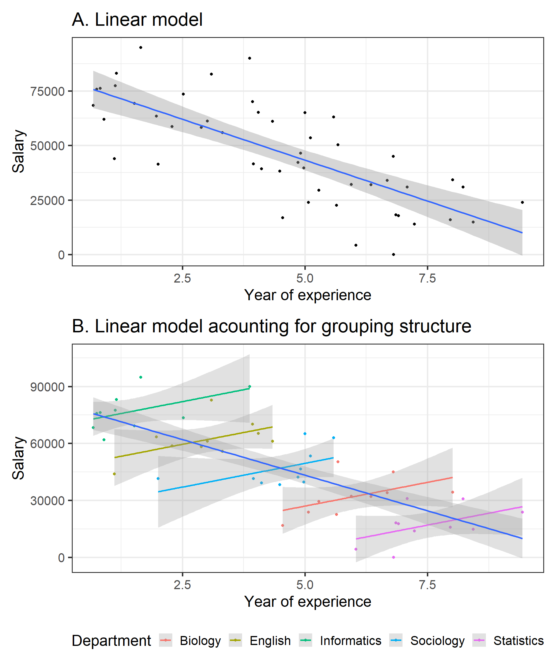
Imagine we’re looking at how years of experience impact salary at a university. Here’s some simulated data to make it fun.
Code
library(easystats)library(tidyverse)library(patchwork)set.seed(1234)data<-simulate_simpson(n =10, groups =5, r =0.5,difference =1.5)%>%mutate(V2=(V2+abs(min(V2)))*10000)%>%rename(Department =Group)# Lookup vector: map old values to new oneslookup<-c(G_1 ="Informatics", G_2 ="English", G_3 ="Sociology", G_4 ="Biology", G_5 ="Statistics")# Replace values using the lookup vectordata$Department<-lookup[as.character(data$Department)]one=ggplot(data, aes(x =V1, y =V2))+geom_point()+geom_smooth(method ='lm')+labs(y='Salary', x='Year of experience', title ="A. Linear model")+theme_bw(base_size =20)two=ggplot(data, aes(x =V1, y =V2))+geom_point(aes(color =Department))+geom_smooth(aes(color =Department), method ="lm", alpha =0.3)+geom_smooth(method ="lm", alpha =0.3)+labs(y='Salary', x='Year of experience', title ="B. Linear model acounting for grouping structure")+theme_bw(base_size =20)+theme(legend.position ='bottom')(one/two)
Take a look at the first plot. Whoa, wait a minute—this says the more years of experience you have, the less you get paid! What kind of backwards world is this? Before you march into HR demanding answers, let’s look a little closer.
Now, check out the second plot. Once we consider the departments—Informatics, English, Sociology, Biology, and Statistics—a different story emerges. Each department shows a positive trend between experience and salary. In other words, more experience does mean higher pay, as it should!
So what happened? The first plot ignored the hierarchical structure of the data. By lumping all departments together, it completely missed the real relationship hiding in plain sight. This is why Hierarchical Modeling is so powerful—it helps us avoid embarrassing statistical blunders like this one. It allows us to correctly analyze data with nested structures and uncover the real patterns.
Now, this example is a bit of an extreme case. In real life, you’re less likely to find such wildly opposite effects. However, the influence of grouping structures on your analysis is very real—and often subtle. Ignoring them can lead to misleading conclusions.
Ready to explore how Mixed Effects Modeling helps us account for these nested structures? Let’s dive in and get hands-on!
Mixed effects models
So, why are they called mixed effects models? It’s because these models combine two types of effects: fixed effects and random effects……. And now you’re wondering what those are, don’t worry—I’ve got you! 😅
Remember how departments (Informatics, English, Sociology, etc.) completely changed the story about experience and salary? That’s exactly where fixed and random effects come in.
Fixed effects capture the consistent, predictable trends in your data—like the relationship between experience and salary across all departments. These are the big-picture patterns you’re curious about and want to analyze.
Random effects, on the other hand, account for the variability within groups—like how salaries differ between departments. You’re not deeply analyzing these differences, but you know they’re there, and ignoring them could mess up your results.
Without accounting for random effects, it’s like assuming every department is exactly the same—and we’ve already seen how misleading that can be!
The model will estimate the fixed and random effects but don’t worry—the model won’t get super complex. The estimates and p-values will primarily focus on the fixed effects, but it will account for the random effects in the background to make sure the results are accurate. In other words, random effects are variables that you know contribute to the variance in your model, and you want to account for them, but you’re not directly interested in obtaining a result about each one.
Got the gist? Great! Now enough with words…let’s dive into a real example and see these mixed effects in action!
Settings and data
In this section, we’ll load up the libraries and the data we’ll use for this tutorial. The data we’ll work with is simulated to resemble real-world scenarios and you can download the dataset from here:
The lme4 package is the go-to library for running Linear Mixed Models (LMM) in R. To make your life easier, there’s also the lmerTest package, which enhances lme4 by allowing you to extract p-values and providing extra functions to better understand your models. In my opinion, you should always use lmerTest alongside lme4—it just makes everything smoother!
To run our Linear Mixed Effects Model, these are the key packages we’ll use. On top of that, the tidyverse suite will help with data wrangling and visualization, while easystats will let us easily extract and summarize the important details from our models. Let’s get started!
The data
db=read.csv('../../resources/simulation/simulated_data.csv')db$subject_id=factor(db$subject_id)# make sure subject_id is a factorhead(db)
This dataset contains several columns. The performance column holds our primary variable of interest, the performance score. The condition column tells us the experimental condition under which the data was collected, while trial_number marks the specific trial, and subject_id gives each participant a unique identifier.
After reading in the data, I make sure that subject_id is treated as a factor (a categorical variable) rather than a continuous one. This is important because subject_id represents distinct individuals, and treating it as continuous would lead the models to interpret it as a numeric variable, which is incorrect.
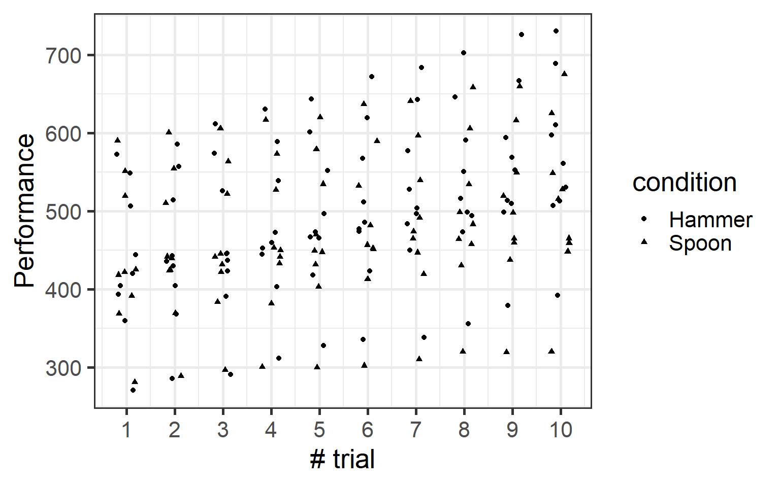
Before diving into modeling, it’s always a good idea to visualize your data first. So, let’s use ggplot2 (a package from the tidyverse family) to get a quick look at our data. This will help us understand the structure and spot any patterns or oddities right away. Let’s do it!
Looking at the plot, there seems to be a small positive trend, but no real difference between the two conditions—hammer and spoon. Also, there’s definitely some weird data pattern, especially near the top. Weird, right?
Let’s dive in and analyze this with a simple linear model. We’ll start by fitting a model that predicts the performance score based on the condition (hammer or spoon).
Linear model
Warning
Throughout this section, and in the tutorial as a whole, we’ll assume you have some familiarity with linear models. You don’t need to be an expert, but we will use terminology and concepts related to linear modeling. Because linear mixed-effects models are simply an extension of linear models, if you aren’t already comfortable with them, I recommend reviewing the basics before continuing.
Call:
lm(formula = performance ~ condition * trial_number, data = db)

Residuals:
    Min      1Q  Median      3Q     Max
-189.83  -44.25  -16.71   63.12  172.09

Coefficients:
                            Estimate Std. Error t value Pr(>|t|)
(Intercept)                  417.333     21.357  19.541  < 2e-16 ***
conditionSpoon                16.593     30.203   0.549    0.583
trial_number                  15.184      3.442   4.411 1.79e-05 ***
conditionSpoon:trial_number   -7.599      4.868  -1.561    0.120
---
Signif. codes:  0 '***' 0.001 '**' 0.01 '*' 0.05 '.' 0.1 ' ' 1

Residual standard error: 93.79 on 176 degrees of freedom
Multiple R-squared:  0.1354,    Adjusted R-squared:  0.1207
F-statistic: 9.188 on 3 and 176 DF,  p-value: 1.113e-05
We won’t delve into the details of the model results in this tutorial, but from the summary, it’s clear that the model reflects what we saw in the plot: performance significantly increases over time, but there’s no clear difference between conditions. Now, let’s visualize it.
The linear model confirmed what we observed in the data: performance increases over time, with no clear difference between conditions. But remember, this is a tutorial about mixed-effects models, so there’s something more to explore!
Mixed Effects
Random Intercept
Alright, let’s start with Random Intercepts! What are they? Well, the name gives it away—they’re just intercepts…but with a twist! 🤔
If you recall your knowledge of linear models, you’ll remember that each model has one intercept—the point where the model crosses the y-axis (when x=0).
But what makes random intercepts special? They allow the model to have different intercepts for each grouping variable—in this case, the subjects. This means we’re letting the model assume that each subject may have a slightly different baseline performance.
Here’s the idea:
One person might naturally be a bit better.
Someone else could be slightly worse.
And me? Well, let’s just say I’m starting from rock bottom.
However, even though we’re starting from different baselines, the rate of improvement over trials can still be consistent across subjects.
This approach helps us capture variation in the starting performance, acknowledging that people are inherently different but might still follow a similar overall pattern of improvement. It’s a simple yet powerful way to model individual differences!
Now, let’s look at how to include this in our mixed model.
Model
To run a linear mixed-effects model, we’ll use the lmer function from the lme4 package. it Functions very similarly to the lm function we used before: you pass a formula and a dataset, but with one important addition: specifying the random intercept.
The formula is nearly the same as a standard linear model, but we include (1|subject_id) to tell the model that each subject should have its own unique intercept. This accounts for variations in baseline performance across individuals.
Linear mixed model fit by REML. t-tests use Satterthwaite's method [
lmerModLmerTest]
Formula: performance ~ condition * trial_number + (1 | subject_id)
   Data: db

REML criterion at convergence: 1439.3

Scaled residuals:
    Min      1Q  Median      3Q     Max
-2.5844 -0.5223 -0.0030  0.5732  3.3163

Random effects:
 Groups     Name        Variance Std.Dev.
 subject_id (Intercept) 9531     97.63
 Residual                132     11.49
Number of obs: 180, groups:  subject_id, 9

Fixed effects:
                            Estimate Std. Error       df t value Pr(>|t|)
(Intercept)                 417.3326    32.6469   8.0925  12.783 1.19e-06 ***
conditionSpoon               16.5930     3.7003 168.0000   4.484 1.35e-05 ***
trial_number                 15.1836     0.4217 168.0000  36.006  < 2e-16 ***
conditionSpoon:trial_number  -7.5991     0.5964 168.0000 -12.742  < 2e-16 ***
---
Signif. codes:  0 '***' 0.001 '**' 0.01 '*' 0.05 '.' 0.1 ' ' 1

Correlation of Fixed Effects:
            (Intr) cndtnS trl_nm
conditinSpn -0.057
trial_numbr -0.071  0.627
cndtnSpn:t_  0.050 -0.886 -0.707
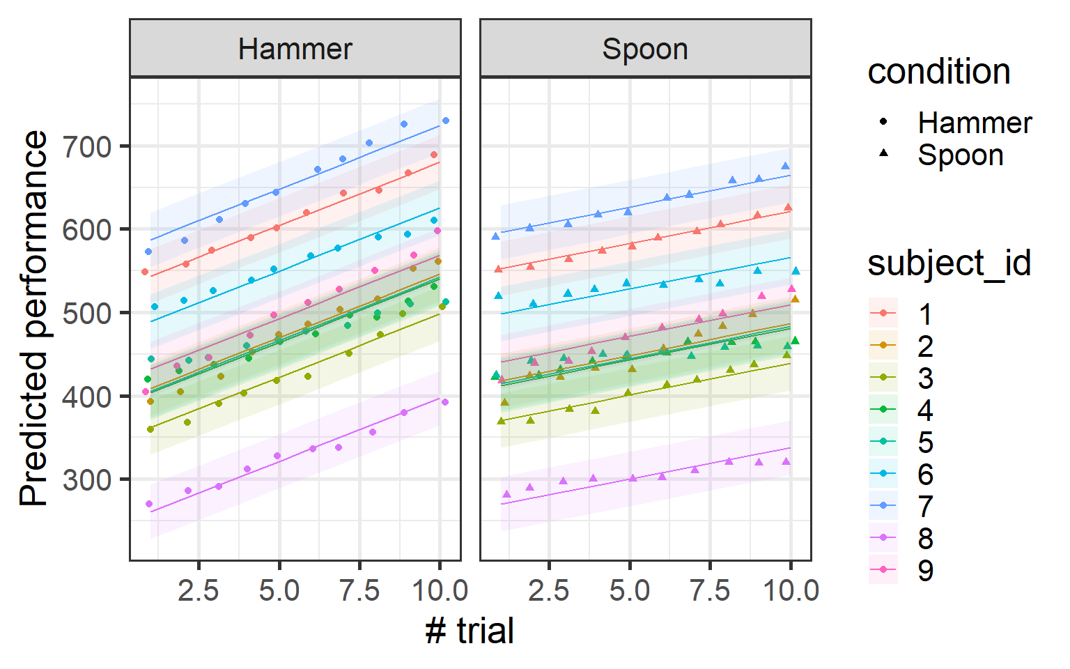
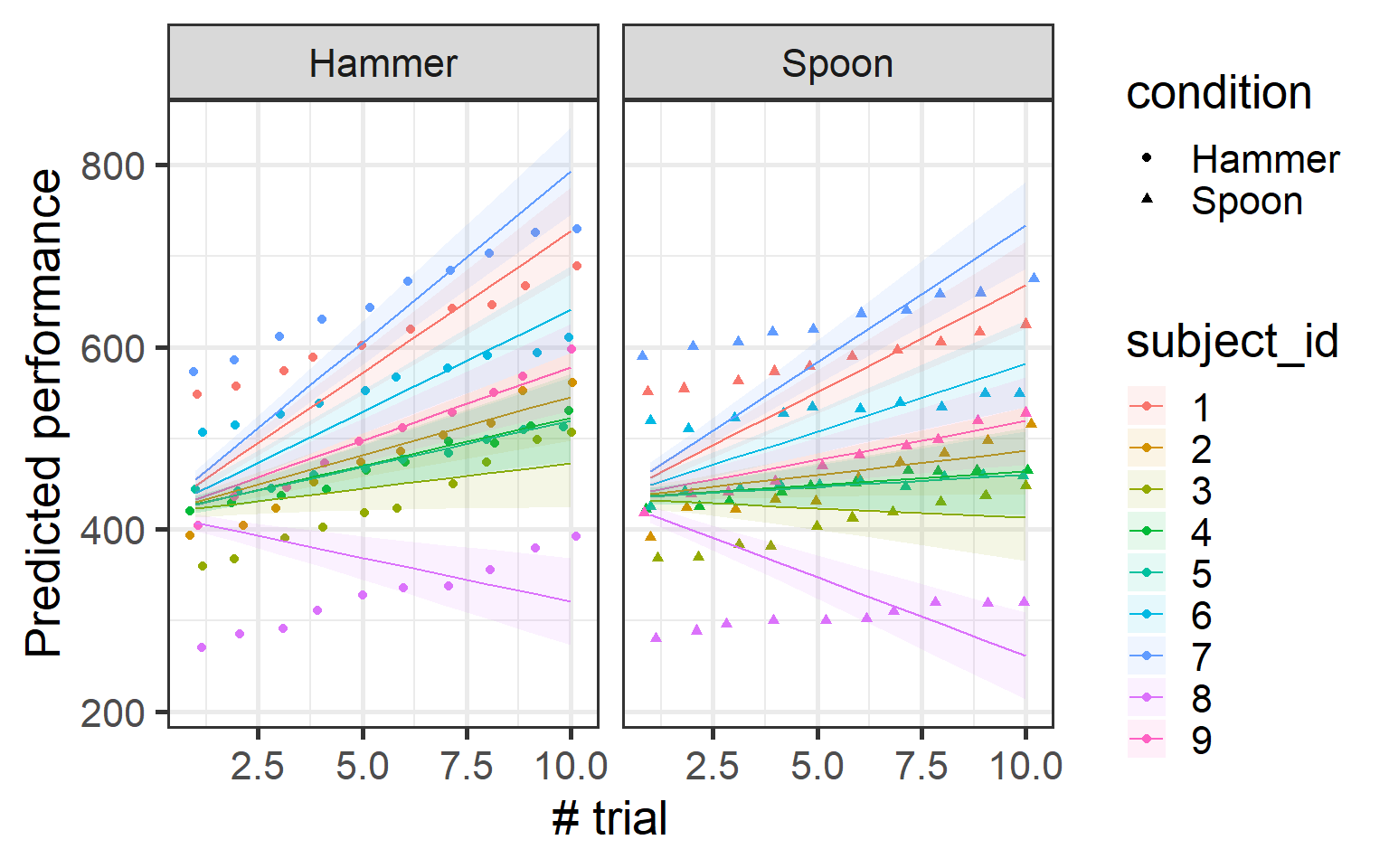
Wow! Now the model is showing us something new compared to the simple linear model. We observe an interaction between condition and trial number. By letting the intercept vary for each subject, the model is able to capture nuances in the data that a standard linear model might miss.
To understand this interaction, let’s plot it and see how performance changes across trials for each condition.
Now, you might be thinking, “This looks interesting, but my plot is going to be a mess with all these individual estimates!” Well, don’t worry! While what we’ve plotted is how the data is modeled by our mixed-effects model, the random effects are actually used to make more accurate estimates—but the model still returns an overall estimate.
Think of it like this: the random effects allow the model to account for individual differences between subjects. But instead of just showing all the individual estimates in the plot, the model takes these individual estimates for each subject and returns the average of these estimates to give you a cleaner, more generalizable result.
Coool!!!!!!! So far, we’ve modeled a different intercept for each subject, which lets each subject have their own baseline level of performance. But here’s the catch: our model assumes that everyone improves over the trials in exactly the same way, with the same slope. That doesn’t sound quite right, does it? We know that some people may get better faster than others, or their learning might follow a different pattern.
Model
This is where we can model random slopes to capture these individual differences in learning rates. By adding (0 + trial_number | subject_id), we’re telling the model that while the intercept (starting point) is the same for everyone, the rate at which each subject improves (the slope) can vary.
This way, we’re allowing each subject to have their own slope in addition to their own intercept, making the model more flexible and reflective of real-world variations in learning!
That plot does look nuts, and it’s a clear signal that something is off. Why? Because by modeling only the random slopes while keeping the intercepts fixed, we’re essentially forcing all subjects to start from the same baseline. That’s clearly unrealistic for most real-world data.
In real life, the intercept and slope often go hand-in-hand for each subject.
Model
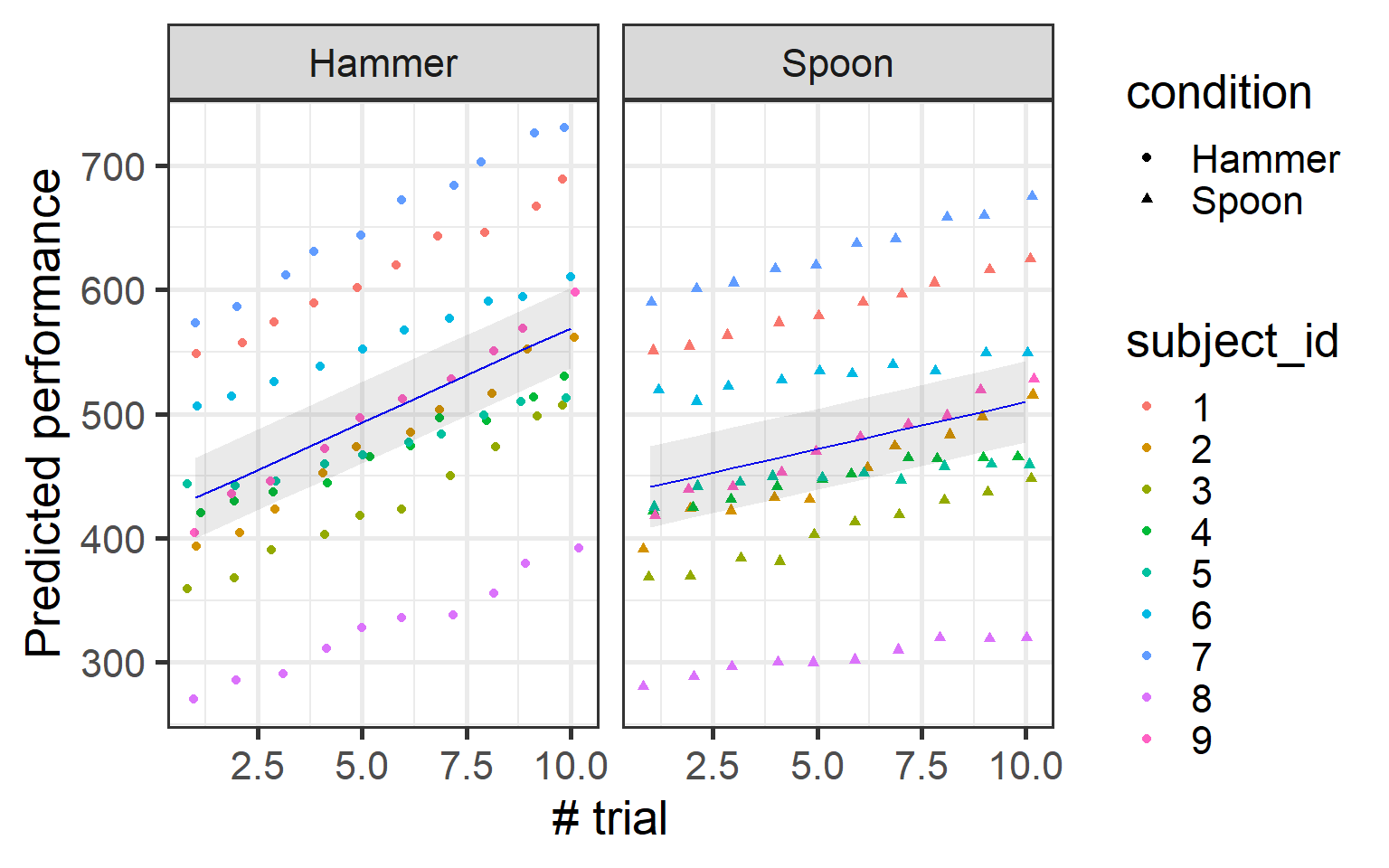
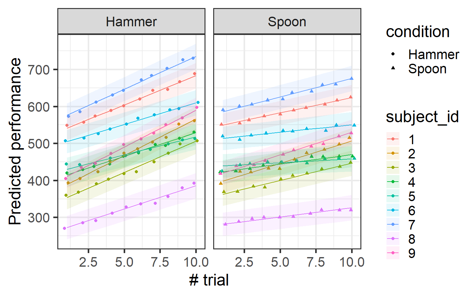
To make the model more realistic, we can model both the random intercept and the random slope together. We simply modify the random effects part of the formula to (trial_number | subject_id).
Now, we are telling the model to estimate both a random intercept (baseline performance) and a random slope (rate of improvement). This captures the full variability in how each subject learns over time!
While is not super apparent from the data you can see that different subject have different slopes menaing that they all not grow at the same rate
Summary of mixed models
Now that we’ve seen how to run mixed-effects models, it’s time to focus on interpreting the summary output. While we’ve been building models, we haven’t delved into what the summary actually tells us or which parts of it deserve our attention. Let’s fix that!
To start, we’ll use our final model and inspect its summary. This will give us a chance to break it down step by step and understand the key information it provides. Here’s how to check the summary:
Linear mixed model fit by REML. t-tests use Satterthwaite's method [
lmerModLmerTest]
Formula: performance ~ condition * trial_number + (trial_number | subject_id)
   Data: db

REML criterion at convergence: 1198.6

Scaled residuals:
    Min      1Q  Median      3Q     Max
-3.0164 -0.5921  0.0796  0.5935  2.8312

Random effects:
 Groups     Name         Variance Std.Dev. Corr
 subject_id (Intercept)  9002.77  94.883
            trial_number   13.56   3.682   0.03
 Residual                  25.52   5.052
Number of obs: 180, groups:  subject_id, 9

Fixed effects:
                            Estimate Std. Error       df t value Pr(>|t|)
(Intercept)                 417.3326    31.6486   8.0100   13.19 1.03e-06 ***
conditionSpoon               16.5930     1.6269 160.0003   10.20  < 2e-16 ***
trial_number                 15.1836     1.2412   8.1812   12.23 1.53e-06 ***
conditionSpoon:trial_number  -7.5991     0.2622 160.0003  -28.98  < 2e-16 ***
---
Signif. codes:  0 '***' 0.001 '**' 0.01 '*' 0.05 '.' 0.1 ' ' 1

Correlation of Fixed Effects:
            (Intr) cndtnS trl_nm
conditinSpn -0.026
trial_numbr  0.027  0.094
cndtnSpn:t_  0.023 -0.886 -0.106
The Random effects section in the model summary shows how variability is accounted for by the random effects. The Groups column indicates the grouping factor (e.g., subject), while the Name column lists the random effects (e.g., intercept and slope). The Variance column represents the variability for each random effect—higher values indicate greater variation in how the effect behaves across groups. The Std.Dev. column is simply the standard deviation of the variance, showing the spread in the same units as the data.
The Corr column reflects the correlation between random effects, telling us whether different aspects of the data (e.g., intercepts and slopes) tend to move together. A negative correlation would suggest that higher intercepts (starting points) are associated with smaller slopes (slower learning rates), while a positive correlation would suggest the opposite.
The Residual section shows the unexplained variability after accounting for the fixed and random effects.
The key takeaway here is that random effects capture the variability in the data that can’t be explained by the fixed effects alone. If the variance for a random effect is low, it suggests the random effect isn’t adding much to the model and may be unnecessary. On the other hand, high variance indicates that the random effect is important for capturing group-level differences and improving the model’s accuracy.
Model comparison
But how can we be sure the random effects are helping our model? One of the easiest ways is to check the variance explained by the random effects. As we said if the variance related to the random effects is too small, it probably isn’t contributing much to the model. If it’s high, it’s likely helping the model by capturing important variability in the data.
Another method is to compare the performance of different models. One of the best indices for this is the Akaike Information Criterion (AIC). AIC gives a relative measure of how well a model fits the data, while penalizing the number of parameters in the model. Lower AIC values indicate better models, as they balance goodness-of-fit with model complexity.
You can compare the AIC of different models using the following:
# Comparison of Model Performance Indices

Name               |           Model |  AIC (weights)
-----------------------------------------------------
Linear_mod         |              lm | 2151.5 (<.001)
Intercept_mod      | lmerModLmerTest | 1463.2 (<.001)
Slope_mod          | lmerModLmerTest | 1913.9 (<.001)
InterceptSlope_mod | lmerModLmerTest | 1226.0 (>.999)
As you can see, the best model based on AIC is the one with both intercept and slope. This is a good way to check if and which random effect structure is necessary for our model.
Warning
Never decide if your random effect structure is good by just looking at p-values! P-values are not necessarily related to how well the model fits your data. Always use model comparison and fit indices like AIC to guide your decision.
Formulary
In this tutorial, we introduced linear mixed-effects models. However, these models can be far more versatile and complex than what we’ve just explored. The lme4 package allows you to specify various models to suit diverse research scenarios. While we won’t dive into every possibility, here’s a handy reference for the different random effects structures you can specify
Formula
Description
(1|s)
Random intercepts for unique level of the factor s.
(1|s) + (1|i)
Random intercepts for each unique level of s and for each unique level of i.
(1|s/i)
Random intercepts for factor s and i, where the random effects for i are nested in s. This expands to (1|s) + (1|s:i), i.e., a random intercept for each level of s, and each unique combination of the levels of s and i. Nested random effects are used in so-called multilevel models. For example, s might refer to schools, and i to classrooms within those schools.
(a|s)
Random intercepts and random slopes for a, for each level of s. Correlations between the intercept and slope effects are also estimated. (Identical to (a*b|s).)
(a*b|s)
Random intercepts and slopes for a, b, and the a:b interaction, for each level of s. Correlations between all the random effects are estimated.
(0+a|s)
Random slopes for a for each level of s, but no random intercepts.
(a||s)
Random intercepts and random slopes for a, for each level of s, but no correlations between the random effects (i.e., they are set to 0). This expands to: (0+a|s) + (1|s).
---title: "Linear mixed effect modesl"description: Very short tutorial on how to what are and hwo to run Linear mixed effects models.author-meta: "Tommaso Ghilardi"categories: - R - Stats - Mixed effects models---```{=html}<div style="display: flex; align-items: center;"> <div style="flex: 1; text-align: left;"> <p>Welcome to this introduction to Linear Mixed-effects Models (LMM)!! In this tutorial we will use R to run some simple LMM and we will try to understand together how to leverage these model for our analysis. LMMs are amazing tools that have saved our asses countless times during our PhDs and Postdocs. They'll probably continue to be our trusty companions forever.</p> </div> <div style="flex: 0 0 auto; margin-left: 10px;"> <iframe src="https://giphy.com/embed/ygCtKUnKEW5F6LruQd" width="100" height="100" frameborder="0" allowfullscreen></iframe> <p style="margin: 0;"><a href="https://giphy.com/gifs/TheBearFX-ygCtKUnKEW5F6LruQd"></a></p> </div></div>```::: callout-notePlease bear in mind that this tutorial is designed to be a gentle introduction to running linear mixed-effects models. It will not delve into the mathematics and statistics behind LMM. For those interested in these aspects, numerous online resources are available for further exploration.:::This tutorial introduces the statistical concept of Hierarchical Modeling, often called Mixed Effects Modeling. This approach shines when dealing with nested data—situations where observations are grouped in meaningful ways, like students within schools or measurements across individuals.Sounds like a mouthful, right? Don’t worry! Let’s kick things off with something a little more fun: Simpson’s Paradox.Simpson's Paradox is a statistical head-scratcher. It’s when a trend you see in your data suddenly flips—or even vanishes—when you split the data into groups. Think of it as the “oops” moment in data analysis when you realize you missed something big. Ready to see it in action? Let’s dive in!Imagine we’re looking at how years of experience impact salary at a university. Here’s some simulated data to make it fun.```{r SimpsonParadox}#| code-fold: true#| message: false#| warning: false#| fig-height: 12#| fig-width: 10library(easystats)library(tidyverse)library(patchwork)set.seed(1234)data <- simulate_simpson(n = 10, groups = 5, r = 0.5,difference = 1.5) %>% mutate(V2= (V2 +abs(min(V2)))*10000) %>% rename(Department = Group)# Lookup vector: map old values to new oneslookup <- c(G_1 = "Informatics", G_2 = "English", G_3 = "Sociology", G_4 = "Biology", G_5 = "Statistics")# Replace values using the lookup vectordata$Department <- lookup[as.character(data$Department)]one = ggplot(data, aes(x = V1, y = V2)) + geom_point()+ geom_smooth(method = 'lm')+ labs(y='Salary', x='Year of experience', title = "A. Linear model")+ theme_bw(base_size = 20)two = ggplot(data, aes(x = V1, y = V2)) + geom_point(aes(color = Department)) + geom_smooth(aes(color = Department), method = "lm", alpha = 0.3) + geom_smooth(method = "lm", alpha = 0.3)+ labs(y='Salary', x='Year of experience', title = "B. Linear model acounting for grouping structure")+ theme_bw(base_size = 20)+ theme(legend.position = 'bottom')(one / two)```Take a look at the first plot. Whoa, wait a minute—this says the more years of experience you have, the less you get paid! What kind of backwards world is this? Before you march into HR demanding answers, let’s look a little closer.Now, check out the second plot. Once we consider the departments—Informatics, English, Sociology, Biology, and Statistics—a different story emerges. Each department shows a positive trend between experience and salary. In other words, more experience does mean higher pay, as it should!So what happened? The first plot ignored the hierarchical structure of the data. By lumping all departments together, it completely missed the real relationship hiding in plain sight. This is why Hierarchical Modeling is so powerful—it helps us avoid embarrassing statistical blunders like this one. It allows us to correctly analyze data with nested structures and uncover the real patterns.**Now, this example is a bit of an extreme case.** In real life, you’re less likely to find such wildly opposite effects. However, the influence of grouping structures on your analysis is very real—and often subtle. Ignoring them can lead to misleading conclusions.Ready to explore how Mixed Effects Modeling helps us account for these nested structures? Let’s dive in and get hands-on!### Mixed effects modelsSo, why are they called **mixed effects models**? It’s because these models combine two types of effects: **fixed effects** and **random effects**....... And now you’re wondering what those are, don’t worry—I've got you! 😅Remember how departments (Informatics, English, Sociology, etc.) completely changed the story about experience and salary? That’s exactly where fixed and random effects come in.- **Fixed effects** capture the consistent, predictable trends in your data—like the relationship between experience and salary across all departments. These are the big-picture patterns you’re curious about and want to analyze.- **Random effects**, on the other hand, account for the variability within groups—like how salaries differ between departments. You’re not deeply analyzing these differences, but you know they’re there, and ignoring them could mess up your results.Without accounting for random effects, it’s like assuming every department is exactly the same—and we’ve already seen how misleading that can be!**The model will estimate the fixed and random effects** but don’t worry—the model won’t get super complex. The estimates and p-values will primarily focus on the **fixed effects**, but it will account for the **random effects** in the background to make sure the results are accurate. In other words, random effects are variables that you know contribute to the variance in your model, and you want to account for them, but you’re not directly interested in obtaining a result about each one.Got the gist? Great! Now enough with words...let’s dive into a real example and see these mixed effects in action!## Settings and dataIn this section, we’ll load up the libraries and the data we’ll use for this tutorial. The data we'll work with is simulated to resemble real-world scenarios and you can download the dataset from here:```{=html}<a href="../../resources/simulation/simulated_data.csv" download class="btn btn-primary">Download data</a>``````{r Libraries}#| message: false#| warning: falselibrary(lme4)library(lmerTest)library(tidyverse)library(easystats)```The `lme4` package is the go-to library for running Linear Mixed Models (LMM) in R. To make your life easier, there's also the `lmerTest` package, which enhances `lme4` by allowing you to extract p-values and providing extra functions to better understand your models. In my opinion, you should always use `lmerTest` alongside `lme4`—it just makes everything smoother!To run our Linear Mixed Effects Model, these are the key packages we'll use. On top of that, the `tidyverse` suite will help with data wrangling and visualization, while `easystats` will let us easily extract and summarize the important details from our models. Let’s get started!## The data```{r ReadData}db = read.csv('../../resources/simulation/simulated_data.csv')db$subject_id = factor(db$subject_id) # make sure subject_id is a factorhead(db)```This dataset contains several columns. The **performance** column holds our primary variable of interest, the performance score. The **condition** column tells us the experimental condition under which the data was collected, while **trial_number** marks the specific trial, and **subject_id** gives each participant a unique identifier.After reading in the data, I make sure that `subject_id` is treated as a **factor** (a categorical variable) rather than a continuous one. This is important because `subject_id` represents distinct individuals, and treating it as continuous would lead the models to interpret it as a numeric variable, which is incorrect.Before diving into modeling, it’s always a good idea to visualize your data first. So, let’s use `ggplot2` (a package from the `tidyverse` family) to get a quick look at our data. This will help us understand the structure and spot any patterns or oddities right away. Let’s do it!```{r PlotRawData}#| code-fold: true#| message: false#| warning: false#| fig-height: 5#| fig-width: 8ggplot(db, aes(x= trial_number, y = performance, shape = condition))+ geom_point(position= position_jitter(width=0.2))+ theme_bw(base_size = 20)+ labs(y='Performance', x= '# trial')+ scale_x_continuous(breaks = 0:10)```Looking at the plot, there seems to be a small positive trend, but no real difference between the two conditions—hammer and spoon. Also, there's definitely some weird data pattern, especially near the top. Weird, right?Let's dive in and analyze this with a simple linear model. We’ll start by fitting a model that predicts the performance score based on the condition (hammer or spoon).## Linear model::: callout-warningThroughout this section, and in the tutorial as a whole, we’ll assume you have some familiarity with linear models. You don’t need to be an expert, but we will use terminology and concepts related to linear modeling. Because linear mixed-effects models are simply an extension of linear models, if you aren’t already comfortable with them, I recommend reviewing the basics before continuing.:::Here we run the linear model:```{r LinearModel}#| message: false#| warning: falseLinear_mod = lm(performance ~ condition * trial_number, db)summary(Linear_mod)```We won’t delve into the details of the model results in this tutorial, but from the summary, it’s clear that the model reflects what we saw in the plot: performance significantly increases over time, but there’s no clear difference between conditions. Now, let’s visualize it.```{r PlotLinearModel}#| code-fold: true#| message: false#| warning: false#| fig-height: 5#| fig-width: 8l_pred = get_datagrid(Linear_mod, by= 'trial_number')l_pred = bind_cols(l_pred, as.data.frame(get_predicted(l_pred, Linear_mod, ci=T)))ggplot(l_pred, aes(x= trial_number, y= Predicted))+ geom_point(data = db, aes(y= performance, shape= condition), position= position_jitter(width=0.2))+ geom_line(lwd=1.5, color= 'blue')+ geom_ribbon(aes(ymin=Predicted-SE, ymax=Predicted+SE), color= 'transparent', alpha=0.4)+ labs(y='Predicted performance', x='# trial')+ theme_bw(base_size = 20)```The linear model confirmed what we observed in the data: performance increases over time, with no clear difference between conditions. But remember, this is a tutorial about mixed-effects models, so there’s something more to explore!## Mixed Effects### Random InterceptAlright, let’s start with **Random Intercepts**! What are they? Well, the name gives it away—they’re just intercepts…but with a twist! 🤔If you recall your knowledge of linear models, you’ll remember that each model has **one intercept**—the point where the model crosses the y-axis (when x=0).But what makes random intercepts special? They allow the model to have **different intercepts for each grouping variable**—in this case, the **subjects**. This means we’re letting the model assume that each subject may have a slightly different baseline performance.Here’s the idea:- One person might naturally be a bit better.- Someone else could be slightly worse.- And me? Well, let’s just say I’m starting from rock bottom.However, even though we’re starting from different baselines, **the rate of improvement over trials can still be consistent across subjects**.This approach helps us capture **variation in the starting performance**, acknowledging that people are inherently different but might still follow a similar overall pattern of improvement. It’s a simple yet powerful way to model individual differences!Now, let’s look at how to include this in our mixed model.#### ModelTo run a **linear mixed-effects model**, we’ll use the `lmer` function from the **lme4** package. it Functions very similarly to the `lm` function we used before: you pass a formula and a dataset, but with one important addition: specifying the **random intercept**.The formula is nearly the same as a standard linear model, but we include `(1|subject_id)` to tell the model that each subject should have its own unique intercept. This accounts for variations in baseline performance across individuals.```{r InterceptModel}Intercept_mod =lmer(performance ~ condition * trial_number + (1|subject_id ), db)summary(Intercept_mod)```Wow! Now the model is showing us something **new** compared to the simple linear model. We observe an **interaction between condition and trial number**. By letting the intercept vary for each subject, the model is able to capture nuances in the data that a standard linear model might miss.To understand this interaction, let’s plot it and see how performance changes across trials for each condition.```{r}#| code-fold: true#| message: false#| warning: false#| fig-height: 5#| fig-width: 8i_pred =bind_cols(db, as.data.frame(get_predicted(Intercept_mod, ci=T)))ggplot(i_pred, aes(x= trial_number, y= Predicted, color= subject_id, shape = condition))+geom_point(data = db, aes(y= performance, color= subject_id), position=position_jitter(width=0.2))+geom_line()+geom_ribbon(aes(ymin=Predicted-SE, ymax=Predicted+SE, fill = subject_id),color='transparent', alpha=0.1)+labs(y='Predicted performance', x='# trial')+theme_bw(base_size =20)+facet_wrap(~condition)```Now, you might be thinking, *“This looks interesting, but my plot is going to be a mess with all these individual estimates!”* Well, don’t worry! While what we’ve plotted is how the data is modeled by our mixed-effects model, the random effects are actually used to make more accurate estimates—but the model still returns an overall estimate.Think of it like this: the random effects allow the model to account for individual differences between subjects. But instead of just showing all the individual estimates in the plot, the model takes these individual estimates for each subject and returns the *average* of these estimates to give you a cleaner, more generalizable result.we can plot the actual estimate of the model:```{r PlotInterceptModelOverall}#| code-fold: true#| message: false#| warning: false#| fig-height: 5#| fig-width: 8i_pred = get_datagrid(Intercept_mod, include_random = F)i_pred = bind_cols(i_pred, as.data.frame(get_predicted(i_pred, Intercept_mod, ci=T)))ggplot(i_pred, aes(x= trial_number, y= Predicted))+ geom_point(data = db, aes(y= performance, color= subject_id, shape = condition), position= position_jitter(width=0.2))+ geom_line(aes(group= condition),color= 'blue')+ geom_ribbon(aes(ymin=Predicted-SE, ymax=Predicted+SE, group= condition),color= 'transparent', alpha=0.1)+ labs(y='Predicted performance', x='# trial')+ theme_bw(base_size = 20)+ facet_wrap(~condition)```### SlopeCoool!!!!!!! So far, we’ve modeled a different intercept for each subject, which lets each subject have their own baseline level of performance. But here’s the catch: our model assumes that everyone improves over the trials in exactly the same way, with the same slope. That doesn’t sound quite right, does it? We know that some people may get better faster than others, or their learning might follow a different pattern.#### ModelThis is where we can model *random slopes* to capture these individual differences in learning rates. By adding `(0 + trial_number | subject_id)`, we’re telling the model that while the intercept (starting point) is the same for everyone, the rate at which each subject improves (the slope) can vary.This way, we’re allowing each subject to have their own slope in addition to their own intercept, making the model more flexible and reflective of real-world variations in learning!```{r SlopeModel}Slope_mod =lmer(performance ~ condition * trial_number + (0+trial_number|subject_id ), db)summary(Slope_mod)```The results aren't too different from the intercept-only model, but let's take a closer look at what we've actually modeled.```{r PlotSlopeModel}#| code-fold: true#| message: false#| warning: false#| fig-height: 5#| fig-width: 8s_pred = bind_cols(db, as.data.frame(get_predicted(Slope_mod, ci=T)))ggplot(s_pred, aes(x= trial_number, y= Predicted, color= subject_id, shape = condition))+ geom_point(data = db, aes(y= performance, color= subject_id), position= position_jitter(width=0.2))+ geom_line()+ geom_ribbon(aes(ymin=Predicted-SE, ymax=Predicted+SE, fill = subject_id),color= 'transparent', alpha=0.1)+ labs(y='Predicted performance', x='# trial')+ theme_bw(base_size = 20)+facet_wrap(~condition)```### Intercept + SlopeThat plot does look nuts, and it’s a clear signal that something is off. Why? Because by modeling only the random slopes while keeping the intercepts fixed, we’re essentially forcing all subjects to start from the same baseline. That’s clearly unrealistic for most real-world data.In real life, the intercept and slope often go hand-in-hand for each subject.#### ModelTo make the model more realistic, we can model both the random intercept and the random slope together. We simply modify the random effects part of the formula to `(trial_number | subject_id)`.Now, we are telling the model to estimate both a random intercept (baseline performance) and a random slope (rate of improvement). This captures the full variability in how each subject learns over time!```{r InterceptSlopeModel}InterceptSlope_mod =lmer(performance ~ condition * trial_number + (trial_number|subject_id ), db)summary(InterceptSlope_mod)```Now, let’s visualize how the model is modeling the data:```{r PlotInterceptSlopeModel}#| code-fold: true#| message: false#| warning: false#| fig-height: 5#| fig-width: 8is_pred = bind_cols(db, as.data.frame(get_predicted(InterceptSlope_mod, ci=T)))ggplot(is_pred, aes(x= trial_number, y= Predicted, color= subject_id, shape = condition))+ geom_point(data = db, aes(y= performance, color= subject_id), position= position_jitter(width=0.2))+ geom_line()+ geom_ribbon(aes(ymin=Predicted-SE, ymax=Predicted+SE, fill = subject_id),color= 'transparent', alpha=0.1)+ labs(y='Predicted performance', x='# trial')+ theme_bw(base_size = 20)+facet_wrap(~condition)```While is not super apparent from the data you can see that different subject have different slopes menaing that they all not grow at the same rate## Summary of mixed modelsNow that we've seen how to run mixed-effects models, it's time to focus on **interpreting the summary output**. While we’ve been building models, we haven’t delved into what the summary actually tells us or which parts of it deserve our attention. Let’s fix that!To start, we’ll use our **final model** and inspect its summary. This will give us a chance to break it down step by step and understand the key information it provides. Here's how to check the summary:```{r SummaryCheck}summary(InterceptSlope_mod)```The **Random effects** section in the model summary shows how variability is accounted for by the random effects. The **Groups** column indicates the grouping factor (e.g., subject), while the **Name** column lists the random effects (e.g., intercept and slope). The **Variance** column represents the variability for each random effect—higher values indicate greater variation in how the effect behaves across groups. The **Std.Dev.** column is simply the standard deviation of the variance, showing the spread in the same units as the data.The **Corr** column reflects the correlation between random effects, telling us whether different aspects of the data (e.g., intercepts and slopes) tend to move together. A negative correlation would suggest that higher intercepts (starting points) are associated with smaller slopes (slower learning rates), while a positive correlation would suggest the opposite.The **Residual** section shows the unexplained variability after accounting for the fixed and random effects.**The key takeaway here is that random effects capture the variability in the data that can’t be explained by the fixed effects alone.** If the variance for a random effect is low, it suggests the random effect isn’t adding much to the model and may be unnecessary. On the other hand, high variance indicates that the random effect is important for capturing group-level differences and improving the model’s accuracy.## Model comparisonBut how can we be sure the random effects are helping our model? One of the easiest ways is to check the variance explained by the random effects. As we said if the variance related to the random effects is too small, it probably isn’t contributing much to the model. If it’s high, it’s likely helping the model by capturing important variability in the data.Another method is to compare the performance of different models. One of the best indices for this is the Akaike Information Criterion (AIC). AIC gives a relative measure of how well a model fits the data, while penalizing the number of parameters in the model. Lower AIC values indicate better models, as they balance goodness-of-fit with model complexity.You can compare the AIC of different models using the following:```{r}compare_performance(Linear_mod, Intercept_mod, Slope_mod, InterceptSlope_mod, metrics='AIC')```As you can see, the best model based on AIC is the one with both intercept and slope. This is a good way to check if and which random effect structure is necessary for our model.::: callout-warningNever decide if your random effect structure is good by just looking at p-values! P-values are not necessarily related to how well the model fits your data. Always use model comparison and fit indices like AIC to guide your decision.:::## FormularyIn this tutorial, we introduced linear mixed-effects models. However, these models can be far more versatile and complex than what we've just explored. The `lme4` package allows you to specify various models to suit diverse research scenarios. While we won’t dive into every possibility, here’s a handy reference for the different random effects structures you can specify```{=html}<table border="1" style="width: 100%; border-collapse: collapse;"> <thead> <tr> <th style="white-space: nowrap;">Formula</th> <th>Description</th> </tr> </thead> <tbody> <tr> <td style="white-space: nowrap;">(1|s)</td> <td>Random intercepts for unique level of the factor <code>s</code>.</td> </tr> <tr> <td style="white-space: nowrap;">(1|s) + (1|i)</td> <td>Random intercepts for each unique level of <code>s</code> and for each unique level of <code>i</code>.</td> </tr> <tr> <td style="white-space: nowrap;">(1|s/i)</td> <td> Random intercepts for factor <code>s</code> and <code>i</code>, where the random effects for <code>i</code> are nested in <code>s</code>. This expands to <code>(1|s) + (1|s:i)</code>, i.e., a random intercept for each level of <code>s</code>, and each unique combination of the levels of <code>s</code> and <code>i</code>. Nested random effects are used in so-called multilevel models. For example, <code>s</code> might refer to schools, and <code>i</code> to classrooms within those schools. </td> </tr> <tr> <td style="white-space: nowrap;">(a|s)</td> <td> Random intercepts and random slopes for <code>a</code>, for each level of <code>s</code>. Correlations between the intercept and slope effects are also estimated. (Identical to <code>(a*b|s)</code>.) </td> </tr> <tr> <td style="white-space: nowrap;">(a*b|s)</td> <td> Random intercepts and slopes for <code>a</code>, <code>b</code>, and the <code>a:b</code> interaction, for each level of <code>s</code>. Correlations between all the random effects are estimated. </td> </tr> <tr> <td style="white-space: nowrap;">(0+a|s)</td> <td>Random slopes for <code>a</code> for each level of <code>s</code>, but no random intercepts.</td> </tr> <tr> <td style="white-space: nowrap;">(a||s)</td> <td> Random intercepts and random slopes for <code>a</code>, for each level of <code>s</code>, but no correlations between the random effects (i.e., they are set to 0). This expands to: <code>(0+a|s) + (1|s)</code>. </td> </tr> </tbody></table>```